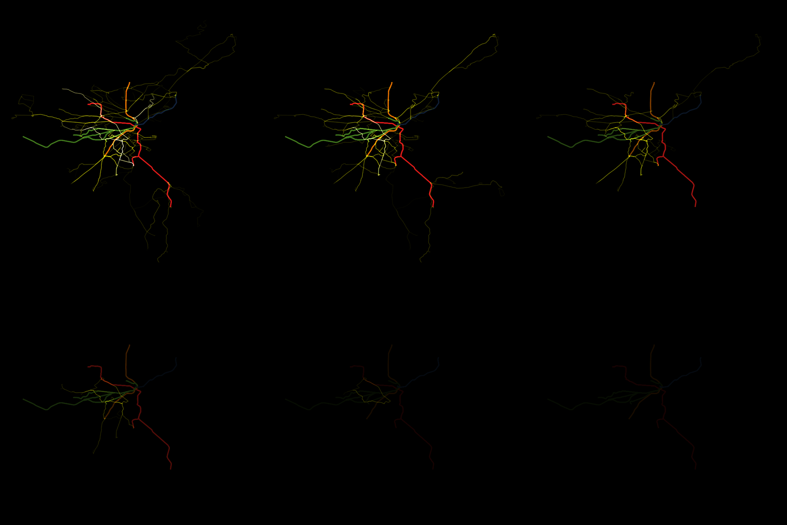
This map shows the ridership data from the MBTA Late Night Data Challenge in the form of a map, with ridership broken down by bus line (yellow lines), subway line, and subway station (white dots). Each frame of the animation corresponds to 15 minutes of ridership data.
This animation is based on the late night ridership data available from github, as well as on the shape information from MBTA's GTFS data. Source code is available on github.